


Qmatcha
Branding
We started the Qmatcha journey with their branding, based very largely on their ethos of its organic origin, its natural freshness and calm, we produced a branding which is not only minimalistic and clean, we also came up with their streamline ‘Zen in tin’.
Transformation
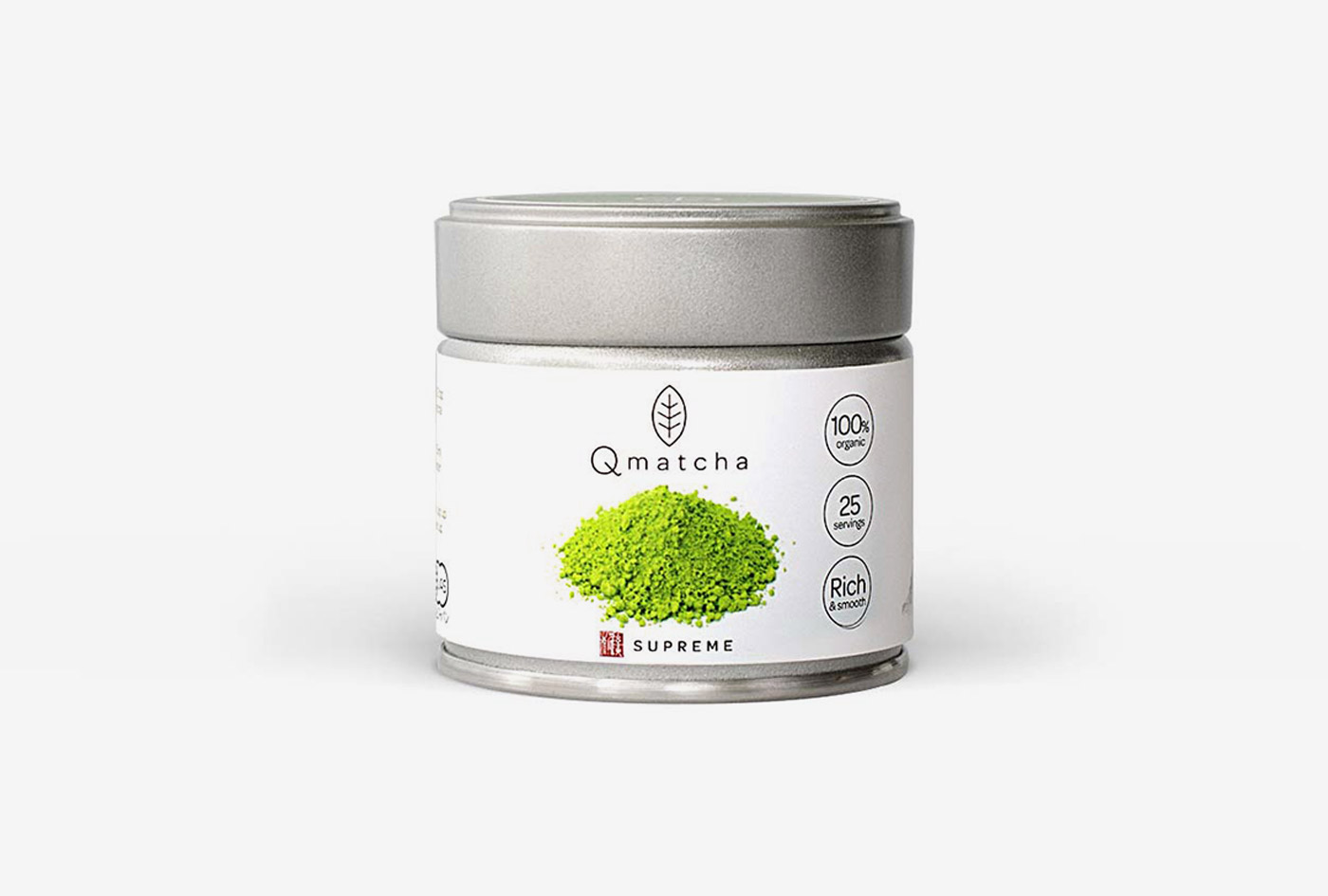
The packaging
Due the nature of its size, we have used minimal design approach and plenty of white space that allows every element of the information to be easily digestible on each packaging.
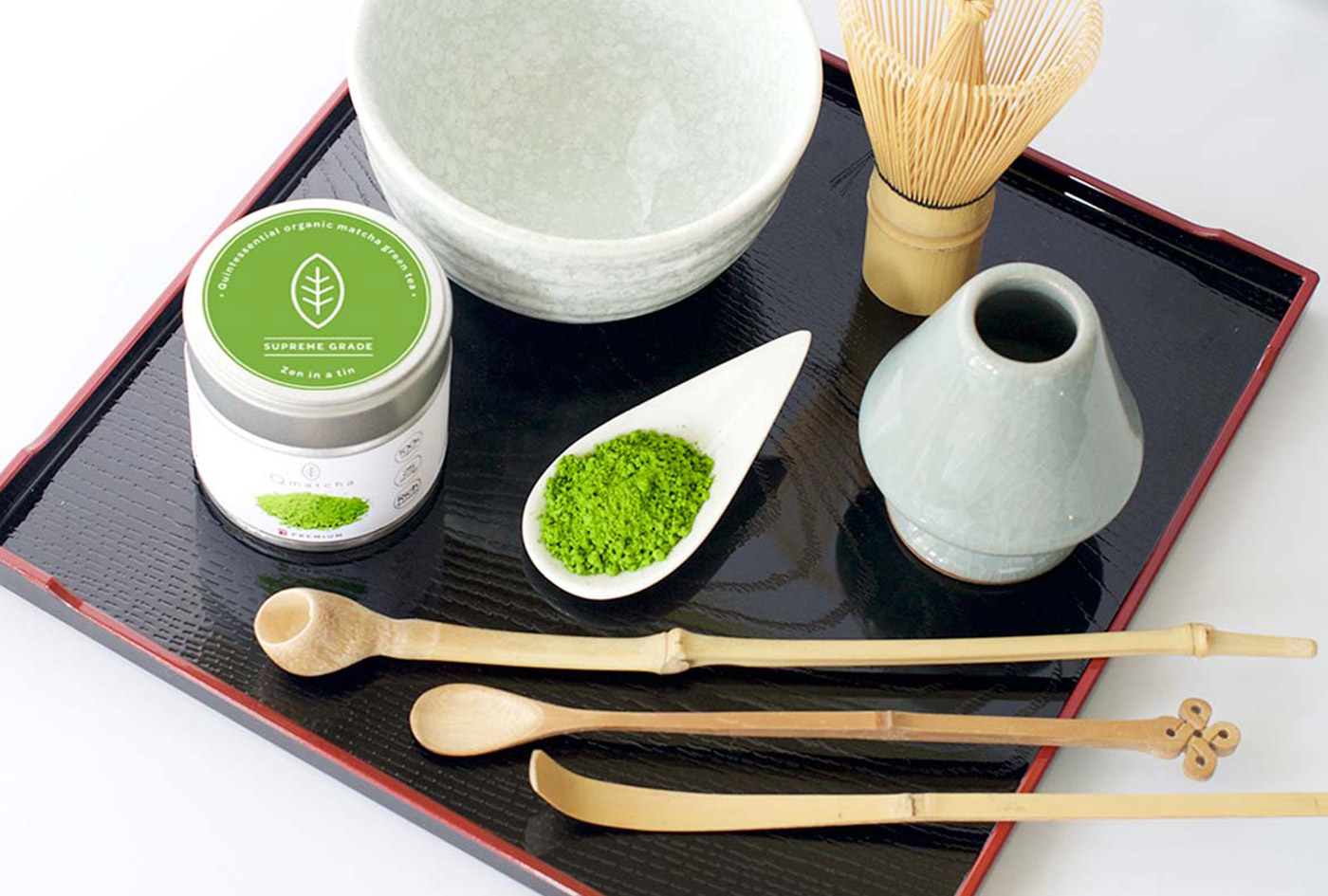
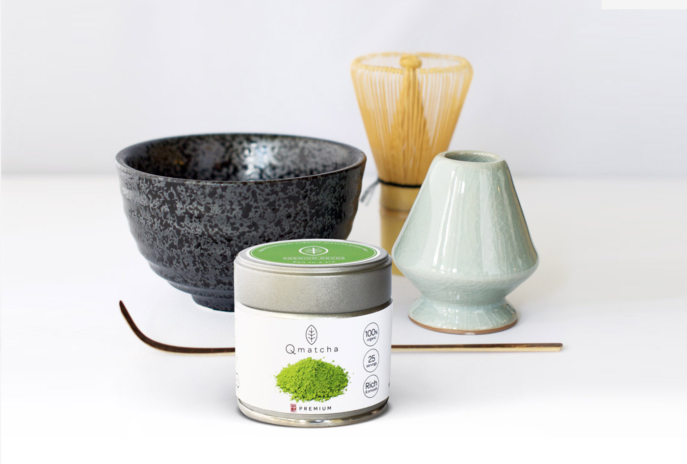
The photography
Adopting to their brand, we have also opted for white background product photography principle that not only allow us to showcase the wonderful packaging, but to also produce photographs that will be easily fit into their commerce website.
Result
A strong brand name, story and identity which reflect the company’s principles and ethos. It is used as a building block to drive the strategy for the brand; including its web presence, packaging, and marketing campaigns.
Client
Date
1 August 2018
Category
Branding, Print