Website coming soon


Ninie’s Kitchen Packaging
Problem statement
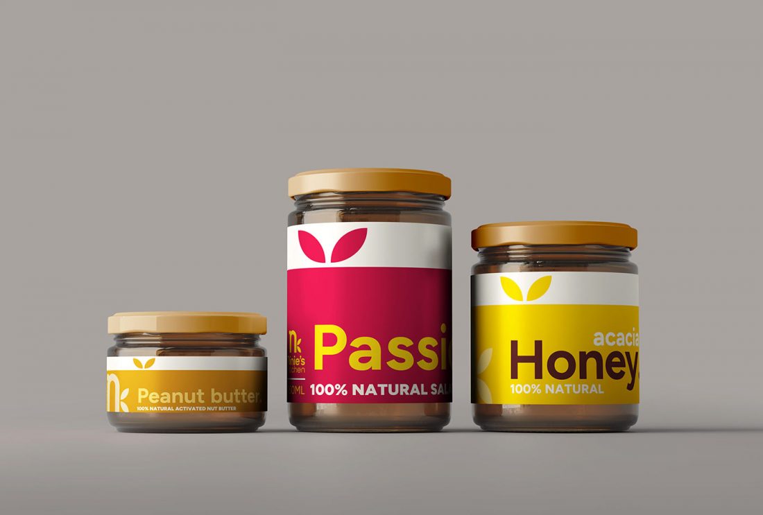
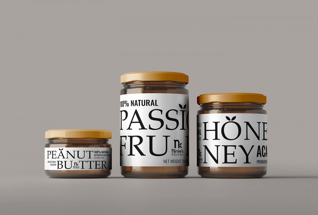
Ninie’s Kitchen produces artisan fine foods and they we believe that food should taste great and be healthy. That’s why they use the best quality natural and organic ingredients to make their products. In this butter series their product is handmade using traditional farmhouse recipes and only the best fruits and natural ingredients with no sugar or chemical additives in their product line. Ninie’s Kitchen would like to redesign their packaging to reflect their values of cleanm, healthy eating and ensure that their packaging line is bold, simple yet noticeable amongst other brands on the shop shelves.
Transformation
We did a competitor analysis and conducted user research to understand the type of aesthetics that may stand out against other products in the market. The use of big, bold typography is prominent on the packaging and states clearly the name of the product, with minimum branding elements. We believe that customer’s curiosity will lead to brand recognition whilst the use colour has been reduced to a minimum to ensure coherent and consistent design across Ninie’s Kitchen product line.
Date
10 June 2023
Category
Packaging, Print