
Problem Statement
-
Interactions with add to basket have dropped year on year affecting conversion
-
Customer feedback is that key information is difficult to find to support making a decision on whether the product & services meets their needs
-
The total number of bundles (main product with an add on) purchased has fallen
-
Customers feedback is that identifying similar models of television is very important to making an informed decision
Bearing in mind the current design and customer / business pain points, the brief is to complete design analysis and give recommendations. We are keen to see your process and observations.
Discovery phase
Questions
What are the problems?
Where do I start?
What do I know?
What’s the existing experience like?
What are the constraints?
Task Interpretation
UXUI Design exercise
Information design exercise
Interactions design exercise
Create Exceptional experience
Planning & Execution
The Approach
-
Documentation
-
Understand problem statement
-
Own experience, make notes
-
Review existing journey
-
Note observations
Definition phase
Develop a clear creative brief that frames the fundamental design challenges.
Questions
What data do I have?
Who am I designing for?
What is JL’s archetypal customer?
What is the existing customer behaviours?
Which device is most popular?
How long is general dwell time and what are the hotspots?
What are the best options & solutions?
What is the most common entry point to this page?
What is the traffic on this page like and where are they from?
How much time do I have?
The Approach
-
Sizing, planning & realistic estimate including prototyping and testing
-
Persona creation, assumptions
-
Possible entry points (not essential)
-
Competitor analysis & best examples in the industry
-
Identify and consider all possibilities
-
Prioritisation
-
Feasibility
Observations
“Interactions with add to basket have dropped”
“Difficult to find information” “Number of bundles have fallen”
“Identifying similar models of television is very important”
Content
- Content-heavy, too much to look at
- Difficult to read & find information (esp. on mobile)
- The ‘Promotional Code’ section is not easy to understand
- The bundle is not visually engaging and hard to understand
Information Architecture
- When user clicks on ‘Product Description’, it anchors down below the CTA to ‘Add to basket’ and logical sequence after reading the information, user would look for CTA below it and not above
- ‘Product Description’, ‘Specifications’, ‘Brand info’, ‘Delivery options & Ratings’ section feels detached from the main product summary and price
- Upsell is distracting the flow
Section boundaries
- Sections boundaries are not clear.
- ‘Customer also viewed’ section separates the main product summary and product info section.
- The bundle section is not clear – ‘Perfect partners’ and ‘Don’t forget’ section is a small part of the ‘Product Description’
Interaction
- Due to the length of the page, there is no quick way to get back to the top
- Amount of scroll causes fatigue
- CTA to Add to Basket is not always visible
- When selecting an add-on, unexpected information popped up
- Noticed the compare function is on the product list page and there is no section to show the variant of the similar TV – size, type, other brand?
Design & Development phase
My objective is to create simple, functional and visually engaging UI that enables customer to find the information they need to make an informed decision on adding item into basket and confidence in taking on bundles and add ons.
Questions
What are my ideas/inspirations?
How will I capture these ideas?
What resources do I have?
How much time do I have to create UI Toolkit?
What’s the fastest way to achieve framework?
Which breakpoint?
How do I reduce friction?
Design Tasks
-
Come up with hypothesis
-
Sketch & brainstorm
-
Assess impact on each solution
-
Create UI Toolkit in Sketch
-
Concepts development
-
Prototyping solutions
-
Build a presentation
-
User testing
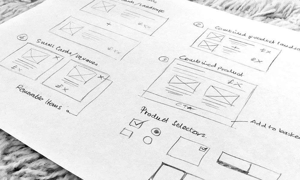


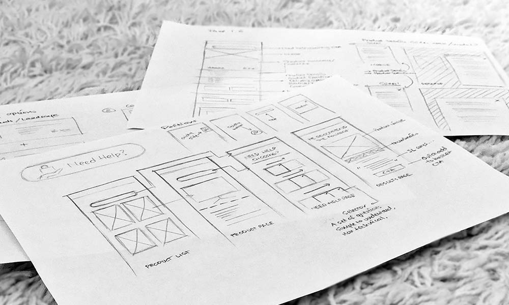
UI Toolkit in Sketch
Ideas & opportunities
Ideal Traits
-
Personalisation
-
Contextual
-
Checkout is easy, basket is visible
-
Improve clarity and findability of core information
-
Increase focus on content
-
Clear products images, videos, and descriptions
-
Enable upselling and cross-selling
-
Convenient filtering, navigation, and search
-
Social proof
Ideas list
- Sticky Basket/CTA – Ensuring Add to Basket is visible
- Personalisation Tool – Need help choosing?
- John Lewis says – Reassurance
- Bundle improvements – Visual and clear
- Similar item feature Comparison – to help users make decisions
- Reduce scroll – keeps users focused and avoid fatigue
- Remove repetitive links – to reduce confusion
- Awareness and educational piece
- Search using photo – find similar item (mobile/App)
- Community growth – enabling Q&A between community members
User testing
Details
Methodology: A/B
Scenario: Buying TV for the first time
Core task: Findability and usability
Participants: 3 (savvy, non-savvy, online shoppers, various age group 25-42)
Success criteria on on findability: Y/N
Success criteria on usability: Ability to understand & proceed without prompt
Ratings: Effort score on each task 1-5
Rating overall: Experience and confidence in buying on version A/B 1-5
Results
Version A
Participant 1 (IG)
Effort score /ease of use: 2.5/5
Confidence in buying: 2.5/5
“Scrolling up and down and changing orientation confuses me, I can’t find what I’m looking for easily”
Participant 2 (ND)
Effort score /ease of use: 1.5/5
Confidence in buying: 1/5
“I can’t find the info I need – it takes too long and frustrating, I might abandon journey at this point and go to Currys”
Participant 3 (JW)
Effort score /ease of use: 4/5
Confidence in buying: 4/5
“Product description is hidden and too far down, it’s hard to find. The structure of the page is confusing – some distractions I don’t need”
Version B
Participant 1
Effort score /ease of use: 5/5
Confidence in buying: 5/5
“I love the reassurance message ‘John Lewis says’ – this ‘Need Help?’ tool makes me feel ‘hugged’. I can find bundles and information easily in this version”
Participant 2
Effort score /ease of use: 5/5
Confidence in buying: 5/5
“Everything is eye level of the product summary and pricing – I don’t have to dig deep. The key feature I love is ‘Need Help Choosing”
Participant 3
Effort score /ease of use: 5/5
Confidence in buying: 5/5
“Nice to use, it’s direct and sections are better separated”